Popcosmo

BLOG TIPS

Smart Girls Conference Recap

BLOG TIPS, EXTRASKim & Chloe4 Comments

If you follow us on Twitter (if you don't, then go follow us!! you definitely want to join us for #ChicChat on Tuesdays at 9EST!) then you would know that last week I had the chance to attend the Smart Girls Conference in New York City. I was able to go on behalf of Dormify to help work the booth and spread the word about who we are (you know, the cutest college & dorm decor EVER!) and I also was able to hear the speakers, well, speak. There were some amazing people there, from Shiza Shahid, the CEO & Co-Founder of the Malala Fund to Carly Heitlinger, from The College Prepster. Everyone had a different insight into what it is like to be a powerful woman, and it was seriously so inspiring! I also love that The Smart Girls Conference embraces "the power of smarts & the power of sisterhood" supporting working together to make everyone stronger instead of competing against each other. I'm lucky to have a group of blog friends that feel the same way, and besides being encouraged by all the powerful women speaking, I also had the chance to meet some of these blog friends in real life for the first time. Like I mentioned in my recent post, meeting blog friends is so cool. They understand that it takes 100 shots to get the right Instagram picture, that wearing the right outfit really is very important, and they just get the blogger's life. Since I had so much fun I decided that I would just share a whole bunch of picture with you guys. I hope you enjoy!!

onetwo six four five1

Oh and in case you’re wondering, the girls pictured (aka the sweetest girls ever) are Sammy from The Preptista, Frannie from the Blonde Prep, Caroline from Citrus & Style, and Sloane from Sailing the Sea of Style.

Hope you had a great weekend too!

xo ~chloe


Creative Classes online

BLOG TIPS, EXTRAS, RANDOM STUFFKim & Chloe6 Comments

Summer's here which means: No. More. School. So why am I so excited to start learning? Because now I can learn exactly what I want! Say what? That's right... I'm ready to start taking even more classes in all things creative. You know, those skills that aren't taught in school,  I'm looking at some creative classes online in photography, calligraphy, some more blogging skills, in-depth photoshop, and... well, I could just keep going. But there are classes for just about anything. I'm interested in more photography and photoshop and my mom wants to learn about coding, and basic DSLR cameras, and maybe even knitting. I'll let her tell you more about creative classes online. Let's get crafting! Creative classes for bloggers

CreativeLive has free live classes in photo & video, art & design, music & audio, craft & maker, money & life. Yeah, so just about everything! I've watched classes on dog photography, but I think I need beginner DSLR classes first. Chloe's interested in Advanced Lightroom and thinks posing and video sound fun too! What I like is that if you miss the classes, or you want to rematch them, you can pay a fee and have them forever. Perfect for bloggers are the graphic design class and a class for redesigning your blog

Lifehacker is a website that has some amazing tips. Simply search photography and you'll get some fantastic ideas and tips. They also have some information about classes occasionally. So, it's not a class or school, but there's always something useful.

Alt on Topic - most of you have hear of Alt Summit, a creative blog conference. While you may not have attended, you can attend classes online. About 1x per month, there are online blogging classes from blogging experts and social media gurus. The classes run all day and could be a quick fix to pick up a lot of info you would get at a conference. There's a cost... but hey, there's no airfare or hotel fees!

Infinite Skills - I like how you join and can learn any area you want for the time period. There is such a diverse range of topics from graphic design, web design, video editing, training in all the Adobe suite, to learning Excel.  You join per month, and have unlimited access to every video in all categories available. I've tried a course and enjoy how the videos are broken down into very small chunks of time.

Skillshare has classes in branding, digital illustration, digital photography entrepreneurship, fashion design, and Chloe's favorite: lettering! She's taken Calligraphy, Lettering for Designers, & Drawing Techniques for Pencil Portraits. I took the Basics of Photoshop. My recommendation as to whether or not the class will be good is to look at the approval rating and the number of students who have taken it.

Craftsy is more arts oriented and looks like you would be going to arts and crafts camp online. There are a ton of classes in knitting, quilting, cake decorating and even photography, jewelry making and paper crafts. I haven't taken any here, but this looks like a fun way to learn a new craft skill. This would be perfect for me to pick up knitting, but also for any day when someone, later this summer, dares to utter the dreaded, "I'm bored." There are a zillion solutions right here for everyone in our family!!

I'm ready for a free afternoon to take new creative classes online and gain a new skill or just try something different and fun... and with all the options literally at our fingertips, anything is possible!

Let me know if I missed one of your favorite places to learn online!


Styling Tips for Fashion posts

BLOG TIPS, EXTRAS, FASHIONKim & Chloe5 Comments

When we revamped our blog last year and started adding fashion posts (of OOTD or WIWN variety) we started scouring our favorite blogs to see what style of posts captured our attention when saw them on the page. We checked to see which posts made us stop in our tracks and look to see what they were wearing, and which posts had cute clothes but didn't really keep us on the page. We developed a checklist of a good style post that we kept in our head, but now it's time to share with you! fashion blogging tips

via Sea of Shoes

  1. Do not have backgrounds growing out of our heads or bodies! (i.e., trees, poles, etc)
  2. Movement and playfulness capture our eye!
  3. Natural light is best and the golden hour is the most flattering
  4. Show the whole outfit in at least 1 photo
  5. Vary the background according to the outfit
  6. Blurred out backgrounds focus the eye on the clothes
  7. Show detail shots, especially of accessories or interesting shoes
  8. Varying angles add visual interest
  9. Have enough photos, but not so many that just becomes repetitive
  10. Have fun & try to look natural, not forced

Someone who inspires our checklist? Gary Pepper Girl! Ok, she does travel to exotic locales practically every day, so of course her photos are absolutely to die for. Plus, many are taken by her boyfriend, so you know he is going to capture her in the most amazing, flattering light and position. But seriously, could her clothes, settings, and photos be any more swoon-worthy?

How to take a great OOTD picture

Winnie Detwa has one of our favorite Instagrams because her photos are ethereal. Most have an earthiness to them (go check out her blog and instagram to see) which is why this photo has always stuck in my mind! Plus, she happens to be one of the nicest people I've (Chloe) met. See how bold she is by having a solid against a solid?  The impact of the pink would be lost against a splashy background. Her eye is just so darned good and we'll always look to her for styling tips and inspiration!

best fashion instagrams

How amazing is Jessica of Tuula Vintage in this picture? A simple silhouette with a remarkable background.

how to take great fashion blog styling tips

via Tuula Vintage

Of course, this is only our list, and if you think of some major bloggers, they make their own rules which just goes to show you that you must create your own checklist and stick to what works for you! Some bloggers have the same background in most of their posts and only show one or two photos or don't even describe what they're wearing. But isn't it better to want more from a post than be overwhelmed? And some go to the other extreme and post such busy pictures that it's hard to tell if they have travel or fashion blogs; but,that's why there are so many blogs! We each have to find our own niche, our own comfort zone and just. rock. it.

Our list of styling tips works for us. Today. But it might change tomorrow, and each season brings a different perspective and each shoot has a new focus. Sometimes we hit a lot of points, sometimes we don't, and that's what makes creating our posts fun and challenging. Plus, where would we be without our beyond incredible photographers, Erin Trimble and Susan Stewart?  A fresh perspective and trained eye is always helpful and it's brought 2 new friends into our lives!

Who are your favorite fashion bloggers… and why do you like their posts? We'd love to hear what's on your list for a good fashion post!

What is #ChicChat?

BLOG TIPS, EXTRASKim & Chloe6 Comments

The best twitter chats Each week on Tuesday from 9-9:30 EST, Chloe hosts #ChicChat. Although Chloe originally thought about having a chat for teens, #ChicChat has quickly evolved into a chat for bloggers of all ages who blog about various topics. Weekly themes are relevant to most bloggers, whether you blog about fashion, sports, lifestyle or crafts. We've discussed Past topics have included blog design and how to stay inspired, and networking, but the most popular chat so far was definitely the chat this week with our guest Robin Zachary of Prop Closet who answered questions about styling photos. As a former Creative Director of Bridal Guide Magazine, and present day stylist and teacher at NYC's Fashion Institute of Technology, she knows all the ins & outs of photo styling and spent her time busily answering questions!

Another highlight of #ChicChat is that we really get to know each other and connect on Twitter. Something that can be hard to do in a forum that where tweets bombard you faster than the temperatures have been changing lately from winter to spring and back again!

If you are new to Twitter chats and need some tips before joining, Chloe wrote a post explaining twitter chats for newbies. <---just click!

So drop any Tuesday between 9-9:30 EST… we look forward to chatting with you!


How to make a GIF… without Photoshop

All, BLOG TIPS, EXTRASKim & Chloe28 Comments

GIFs are all the rage, especially now that you can have GIFS on Pinterest, and there are tons of blog classes on how to make a GIF using Photoshop. But since Chloe is so proficient on Photoshop and the best I can do is turn it on, I haven't quite made it to a class. So when I found out about imgflip, I was dubious, but excited. I tried it out and was so impressed, that I wanted to share it with you! Get ready to learn how to make a GIF without Photoshop skills, y'all!

how to make GIFs

Here's how:

1. Take photos that you want to use to create your GIF or use graphics you've created. Save your images on your computer and make sure they are all the same size. Tip: If taking photos, the key to a successful GIF is to either use a tripod or have very steady hands. If you will be moving items to create a story, then definitely use a tripod since it's almost impossible to get your camera back in the same position, even if you have someone helping. We've found this to be true even when doing GIFS for fashion or style shoots. The less jiggle, the more successful your GIF will look.

2. Open up imgflip.

3. Click on the Images tab (top left).

4. Download your photos and arrange them in the order you want your story to be told to create your GIF. To remove a photo, simply drag it to the pink bar on the bottom that says "Drag images here to remove."

how to create GIFs

5. Once satisfied with your photos, set the width to 360 and height to 360 for a square photo (or 360 for the widest or highest), quality to 1, and click Private. Then click Generate GIF.

creating GIFS

6. Once downloaded, simply upload it to your blog like a regular photo (although after using it a few times, it will give you an image HTML which you can place on your website). Both are super-easy. And voilà, a GIF… and you didn't even need to learn Photoshop!

Creating the GIF is free, but the size is limited to 360 x 360, and supposedly there will be a watermark, and ad will be shown. To upgrade to the Pro version costs $9.95/mo. But as you can see, there is no watermark or ad in the one I created!

making a GIF without Photoshop

Have fun creating GIFs without Photoshop and leave your links to the ones you create in the comments below. We love creating and looking at them 'em!!

xo ~kim

New Year, New Blog Design

All, BLOG TIPS, EXTRASKim & Chloe15 Comments
blogdesign.jpg

How to design the perfect blog layoutChloe and I are at it again… we can't seem to leave (almost) well enough alone and tweaked our blog design again. Maybe it's just the DIY-ers in us, maybe it's because we were on vacation and didn't have access to all our crafts, but one day, maybe it was a really snowy one, we just decided our website needed modifying. Again. Which got us thinking: what makes a blog design effective? What do we look for when we find a blog that makes us think gosh, our website needs updating yet again? Let's start at the top and work our way down, realizing this is what we like (i.e., tips) not hard and fast rules! Header: A header should be distinctive and express your personality and tell your reader who you are or what you do. If I had my way, Popcosmo would have one look and stay the same year to year. But that's me. Chloe, as a teen, is evolving and her taste is changing dramatically year to year. And since she is the designer, her opinion rules, so our header has changed frequently, but one element has stayed consistent: we've always had a heart somewhere in our logo. But we haven't been able to find a heart we like with this new logo!

Consistency is queen (behind creativity) even when your logo changes; but, if you're going to make a dramatic change, then more power to you. If you have a "signature," like our heart, then work around it. We tended to make a change when we rebrand, and then we tweaked the logo to and layout to better express us.

Also, popcosmo doesn't mean anything, we made sure that we mention that we "are a blog for moms, teens and everyone in-between" somewhere on our homepage. BOTH of these items (heart and tagline) are still being fiddled with by us, so check back to see how we resolve them :)

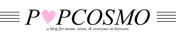
Here's our logo design evolution from our teen site to our present day mom/teen site above. The last two were designed by Chloe:How to design a logo Logo Design Logo Design


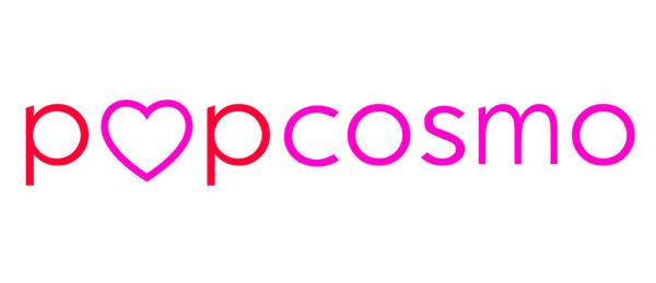
Navigation: Being able to access and navigate around a website should be easy. For instance, if it takes 3 click just to find a story, I'm leaving. Secondarily to reading what is on the landing page, you want your reader to be able to easily navigate through your site. There are typically 3 ways a reader will do this:

  • Menu - typically below the header or on the sidebar. Although they look great on the sidebar, Chloe designed ours below the header, which we both like the look of and the ease of for the reader. A simple drop-down menu is simple for the reader and instinctive when they are looking for where to go.
  • Search Bar - ours is above the fold on every page and critical since we have so many articles that go back more than a few pages
  • Highlighted Posts - We use WP plug-ins and saw a dramatic rise when we installed them. We also added some sections on the sidebar (those big black circles to your right) that weren't on the main menu (but are on the drop-down menu, i.e., Blog Tips). We also have our most popular posts highlighted on the sidebar. It seems a bit like overkill when I write this out, but each person reading a different story will see a different "popular" post or highlighted post and hopefully inspire them to linger longer.

Call to Action: Do you want your reader to sign up for emails or comment? Do you want them to pin a picture, G+, or follow you on Instagram? Then you have to ask very nicely, or hint very loudly, so we make sure our share buttons are prominent at the end of each story. I have to admit, we don't ask our readers to share enough (hey y'all, we love when you share, and we really love it when you follow us on Instagram or Twitter and especially when you leave a comment or share a DIY with us!) but the point is make sure you are asking your readers to do something when they visit you or they'll just pop by and leave.

Font and background:

Don't underestimate the power of design and font!  Chloe and I kid about it, but we'll absolutely pick a restaurant because of a cool font (hello Kitchen in Denver). Won't you leave a website that has a sloppy font and is impossible to read?

We do argue about centered fonts - I can't stand them, she loves them. So, this section is for her. Generally, script fonts are pretty but hard to read. 3-4 fonts should be plenty.  Since we are both font crazy, agreeing on fonts caused considerable arguments, but I think we've finally found a middle ground!

Sidebar: KISS. Yep, Keep It Simple, Stupid. We have so much information we'd love to put in our sidebar, but we just resist the urge. We don't run ads, so that's one thing that keeps it clean, but ads are $$$, so we are considering them. Just make sure they are kept to the same size or within the same block so it doesn't look cluttered. Another idea is to move your ads to the bottom of your sidebar or to the footer.

Happy Thanksgiving

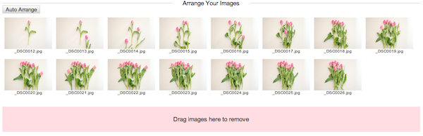
Photos: The bigger the better. Yep, really. Well, sort of. Make them as wide as possible. Know your margins and make the width of your photos the same as your content. It's all about visual appeal and a photo that aligns with your copy is visually appealing. Of course, it can't always be the same width, so center them if they can't be as wide as your copy. If they are larger than your margins, then resize before importing to help with your website speed.

Here's why… you see the same photo above and below, but which looks better?

Happy Thanksgiving

Color: In this case, less is more. Generally, 3-4 colors make a pleasing web design palette and are visually appealing. But we've seen designs with more and less that also work. This is simply a style question of what best represents you, and is not jarring for your readers. Consider how much color will be in your photos / posts and make sure you won't overwhelm your reader, or conversely, that there will be enough color to interest your reader. But, don't forget about whitespace… it can be the difference between a good homepage and a great homepage. Whitespace separates blocks of information and can create balance on a page, which will give it uniformity without clutter.

Contact: Can your readers and brands reach you? Is your contact info on your homepage or readily apparent? Ours is on our advertising page, our press page, and who we are page. We want people to read about us to make sure it's a good fit, BUT we are considering adding an email icon to the homepage.

Consistency: Check the overall design for mood, consistency and balance. Consistency in design allows the eye to flow from one area to the next without distraction and enhances the reader's experience, which in the end, will make them want to come back. And isn't that what we all want?

Are there any web design tips you want to share? Or any web design quirks that drive you crazy? Or any web design advice you want to share with us?

xox ~Kim